Article
That time we designed the Pitchfork logo
A long time ago, in a dirty loft space that smelt like gasoline in a Chicago neighborhood not far away, the Pitchfork logo was concocted in a manner befitting the nascent indie world of the day. For $1500 - which included a site redesign, information architecture and a logo tacked onto the project midway through - and just one quick round of actual ideation, the Pitchfork logo was born. That was 2004. Since then, it has survived Pitchfork becoming an actual business, then a cultural juggernaut, and then someone’s major acquisition. Nothing short of a miracle.
I remember what made Pitchfork “Pitchfork” in the early days of internet music criticism. There were half a dozen indie ones out there with names like Truckfighter, Pillowfight, and … Pitchfork. Only one could keep up with a five day a week schedule of reviews. Only one really had a schedule at all. And to a tiny record label like ours, looking for cheap ways to advertise our releases, there was nothing like it. Someoddpilot Records was known to no one. For $150 and a check made out to Ryan Schrieber, the founder and editor - yes, a paper check, personally made out to him - we could have a rotating banner up there for weeks. Incredible.
And we happened to be both a record label and design studio. We started them simultaneously because we wanted both things: a design studio where my friends and I could pretend to have jobs, and a record label to release our bands’s niche post-rock and electronic records. It was the most natural thing in the world to our 25 year old brains.
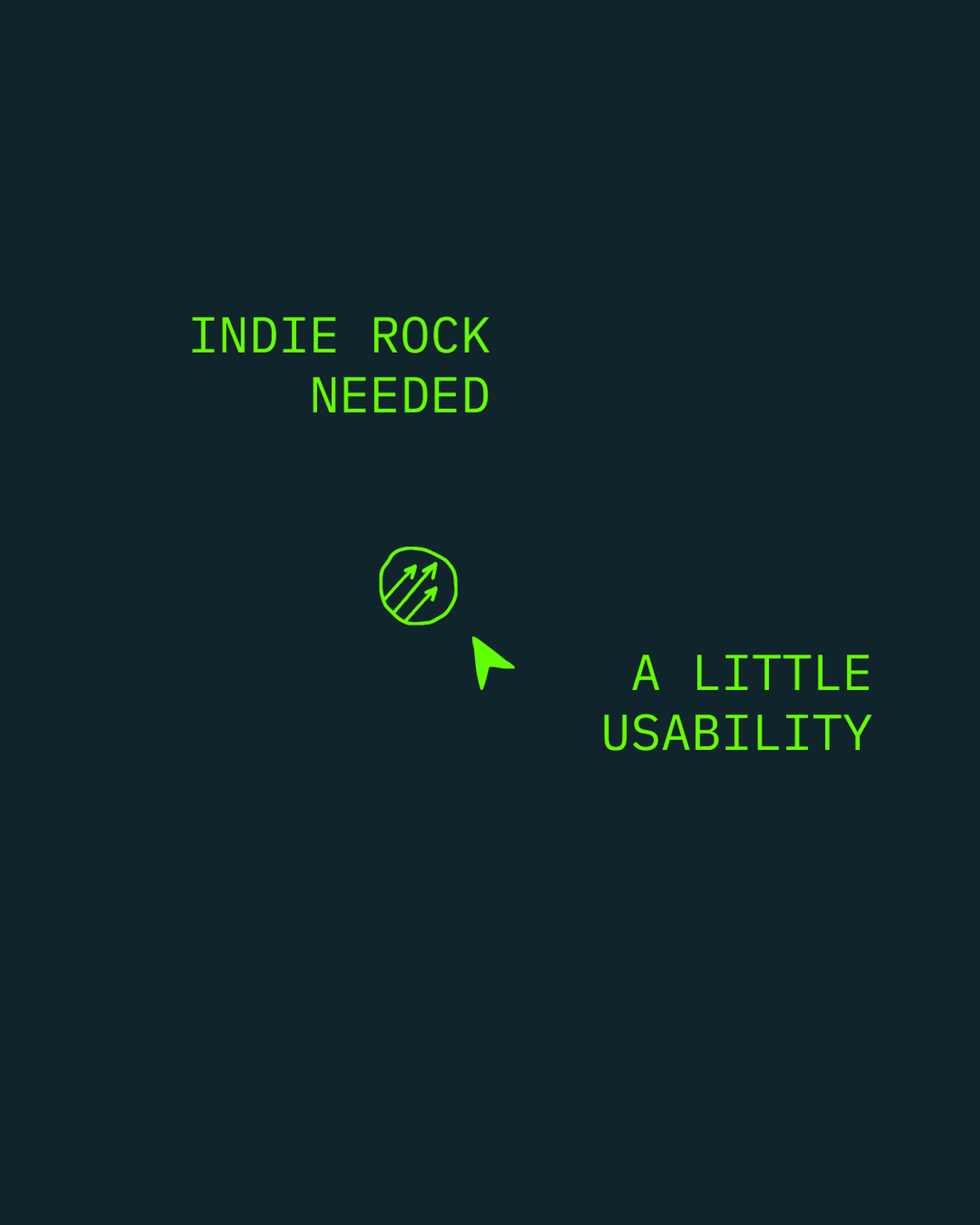
As our record covers and checks slid across his desk, Ryan became familiar with our name. We started doing covers for two other Chicago labels associated with post-rock and hip-hop in town - Chocolate Industries and Consumers Research & Development - and venue posters and websites for the like, because we had to. It was Ryan’s intern who cracked the idea: you know these guys do websites too?We’d managed to convince someone we could do things like making web graphics for a handful of corporate websites, and so we did - in secret - to pay the bills. But our “real” job included designing the first Empty Bottle website – Chicago’s legendary hole-in-the-wall indie rock club – in 1999. I had learned to channel the one into improving the other. Indie rock needed a little usability.
As it happened, the Bottle website was paid for with lifetime admission for any show we ever wanted to see, plus $3000 in beer tabs. For us, it was a fantastic deal. And honestly, it launched our careers. This was the website that told Ryan’s intern we could design websites. I still haven’t worked through that beer tab.
At that point Ryan had been hand coding each page as it went up, each review, and had a mess on his hands: 10,000 hand coded pages to be exact. Very crowded and hard to read pages. He needed it rethought and re-laid out. He also needed a back end to make it all work - articles written by writers anywhere, assigned to so-and-so, checked in and out, edited, then, finally, a way to hit the “publish” button.
He called us up and we got busy. As we hustled through designing the wireframes, we found lovely ways to cram all that content on the homepage and still make it readable, base things on the square covers and haphazard press photos they received (in the mail!), and give it a look that said: reliable, professional, and punk rock. Like, actually.
I knew that prior to this, Ryan had been designing the old site as he went, and every time he did he had made a new tiny pixelated pitchfork to adorn it. I suggested a permanent logo. It was a new idea. It took some back and forth. They finally agreed.
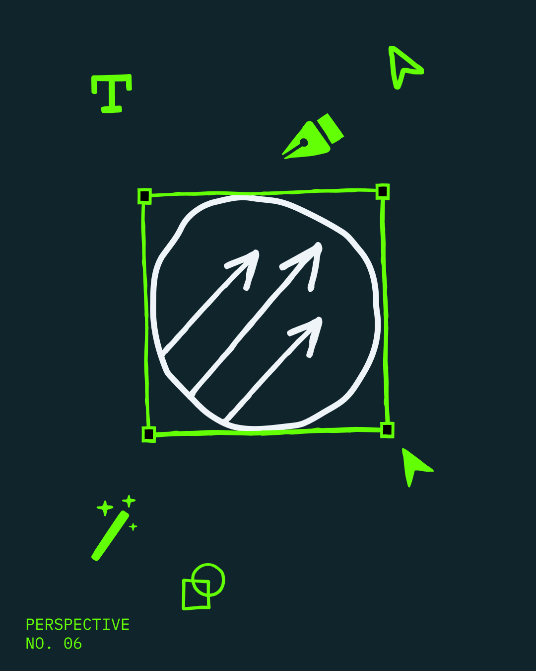
I went straight to something obvious, three arrows inside a circle. I thought about the symbols for male and female, and thought “This is a symbol for everyone” and designed something that could sit next to them, creating a family: man, woman and pitchfork. Pointing forward and up toward the heavens, the only way to go.
When the new site and brand launched in 2005 it was well-received. I had emails pouring in from indie nerds everywhere who wondered how we’d managed to make their favorite website readable while retaining its charm and indie personality. Some of them had jobs with global brands who wanted to work with someone like us who knew how to design things for their favorite demographic in the world. I had never in my life considered this possibility. Though I had been shrewd enough to put that little site tag you’d see in the old days at the bottom of a website: “designed by Someoddpilot.” Got a lot of calls from kids smoking weed in their dorm rooms, too.
While the logo survived, what hasn’t lasted, apparently, is the culture that created it. Kids wondering what record to buy. What’s good, what’s not. The fun of being somewhere kinda ragged - like a friend's living room - independent from the normies and grown-ups in the “real” adult world who want to monetize absolutely everything in sight. Including you and the idea you cooked up in your Rogers Park bedroom. Including a business built around helping indie culture thrive.
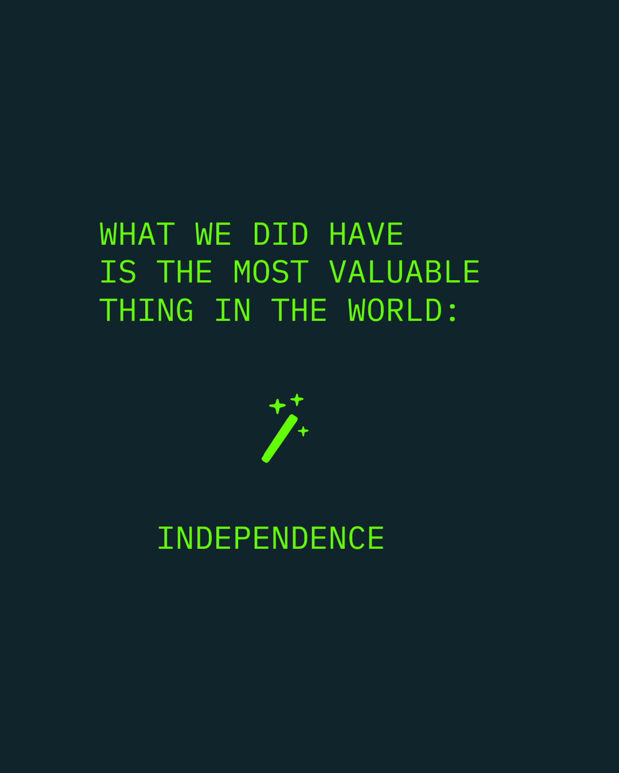
Back then, I earned half of what my peers earned in their design jobs at regular offices. I had roommates until my mid-30’s. I can imagine Ryan and the other P4K founders have similar stories. What we did have is the most valuable thing in the world: independence. We had that in spades.
As my studio celebrates its 25th anniversary this year, and I reflect on why I do what I do, it’s not lost on me that indie culture’s success has been ours, too. Pitchfork rolling up into GQ might just be the most ridiculously perfect metaphor for what’s been lost along the way, as indie culture has become mainstream. This is how things go: people will sleep on couches to do what they think is cool, and then at some point, with the outpouring of all that energy, that thing is worth something. I don’t doubt for a second the next generation is building their version of whatever “independence” is to them. But where exactly did ours go?
When Pitchfork’s lawyers called us out of the blue, maybe around 2006 - well after the meteoric rise of the site had cemented them as the “millennial Rolling Stone” - they wanted to make sure we were cool with the fact that we were not really paid much for that logo. Which I translated to mean: we wouldn’t want to fight anyone later on about it, right? I was genuinely pleased it was still important to them, and signed whatever it was they sent. I had done my part and gotten my reward. Still feel the same.